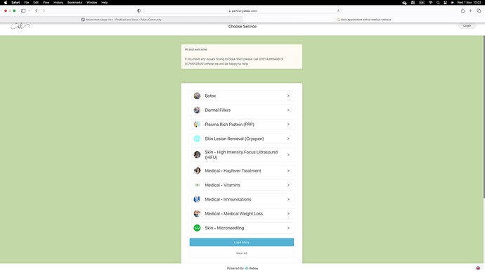
Currently when patients log in the home page is very basic / almost cheap looking
Surely this can be improved with more visible clinic logo, images of clinic and staff make it less generic and individual
Hi.
Thanks for your suggestion.
To clarify, do you refer to the dashboard page of Pabau Connect, where the client can see details about their upcoming appointment and past appointments, or the appointment-specific screen that opens when the client logs in through their confirmation email, to fill in required forms, or cancel or reschedule the appointment?
Kind regards,
Viktor
Hi Amy,
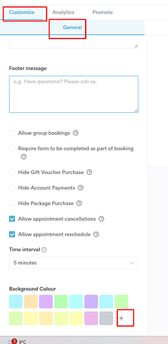
This can be customised to your brand colours, using the following.
then take the hex code from your website or logo and add it in the + and the background will be like your website.

