Suggestions for improvements to Pabau 2
Better marking up pictures
1 Like
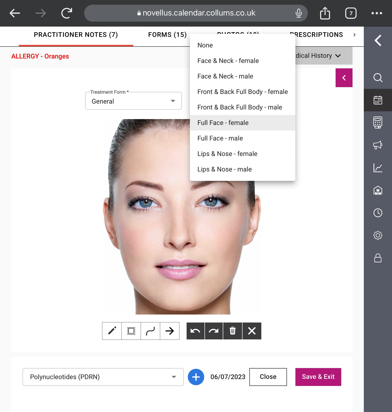
Drop down choice of marking up pictures
- male face
- female face
- zoomed in lips
1 Like
User interface for the patient card needs work. Not as intuitive as some other systems. Order of the ‘summary, appointments, finanacials’ etc column should be user definable.
EMR submenu should have the actual treatment cards as a separate section for: all the other forms
The ‘create’ button in the patient card should have ‘create appointment’ as an option. People may well open the patients card when they start speaking to the patients in clinic/ on the phone, so this shortcut button should have the most common actions on it, and create appointment is one of those
1 Like
Hi Steven, and welcome to our community.
Thank you for all your suggestions. I will notify our team about them.
Better marking up pictures and Drop down choice of marking up pictures (male/female face, zoomed in lips) - can you please elaborate on these suggestions further?
Best,
Viktor
Of course.
The current selection of pictures you can use to mark up in is awful. It needs some better standardised facial images for us to mark up on.
The current software we are using has a default picture of a female face. But it is possible, once you have opened the charting element, to change this to a male face, a zoomed in picture of lips and nose, a body or even a photo of the patient:
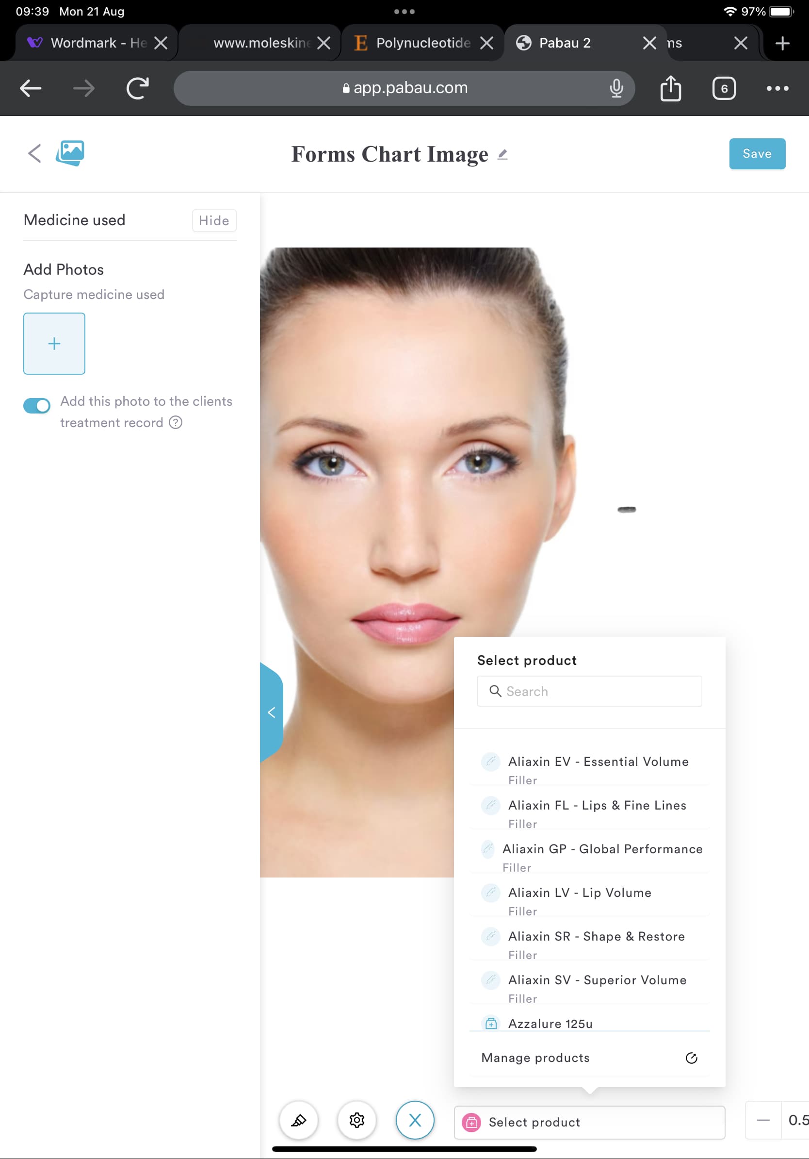
On the treatment forms, the patient drawing subsection. You can search for products. The list of searchable products should be linked to type of product. I.e. if it is a ‘dermal filler’ treatment form then you only need to be able to search dermal fillers; if it is a neurotoxin treatment form I don’t need all the fillers to be there
Thanks for the clarification Steven.
Best,
Viktor
The stripes when you create a Holding are really distracting. Likewise on the calendar when there is no staff scheduled. Why stripes? Was better plain grey. Makes your vision blurred as though an optical illusion. Bad design flaw
1 Like
Invoices were much easier to view and amend on pabau 1. No idea why it’s now broken down into 3 separate tabs.
The cursor doesn’t change when you hover over items like invoice numbers that are clickable. This is basic web page visuals and was present on pabau 1, why has it changed?
1 Like